(An HD+ version of every tutorial will be available after I finished and edited all the parts.)
As a next step I would like to ask you to be my client and give me some directions!
All you have to do is:
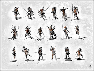
1. Pick your favorite 3 sketches
2. Decide you want to see a male or a female character
3. Pick from the following styles: fantasy, sci-fi, horror, steampunk
4. Post your answers / directions as a comment to this post.
You have 5 days to do this (till 7th midnight Pacific time) and I will make the second part of the tutorial based on your requests and directions.
Take care and I hope you can learn something from this.
> the final image after the first part:
 > and the tutorial video (watch it on youtube to access the full-size video):
11 comments:
top row 2nd one in . middle row 3rd one in and lastly middle row the last one. :) nice work so far btw
Ok JonODonoghue from tweeter here.
Right the ones most interesting for me are, 3rd one from the left top row i.e. 3. First one on the right second row i.e. 12. 13 and 18 also.
I am not sure if this is what you want but this is what comes to my mind when I look at these silhouttes.
No.3 could have some interesting anatomy as his legs are odd or perhaps his left leg could be some kind of flowing cloth. Also there seems to be flowing cloth or wires behind him, makes me think he has something attached that he is pulling along.
no. 12 seems to have some interesting neck piece or perhaps his clothing is made of hard materials that stick out like crystals.
No. 13 seems to me like a woman holding a wip behind her back with perhaps some kind of drooping mouth piece or beak.
No. 18 seems kind of shifty or sneaky. with tattered clothing and a kind of medieval helm.
One last thing I was listening to sidebar podcast of late and not sure if you have heard of it before (well worth listening to if u have not) but on one episode with bobby chiu: http://www.sidebarnation.com/my_weblog/2008/09/ep-63-chiuists.html
And he says when concepting he stares at a black page or blackscreen and draws at the same time so he is completely working from imagination. You might do this already but thought it was cool advice.
I like numbers 1, 3 and 18.
I would like to see fantasy male - based on given choices (because what I REALLY want to see is somekind of half man, half animal fantasy creature :D).
I am really gratefull for that tutorial - keep up good work!
Nice, Mark. 3, 6, and 10. Keep it up man. :)
Hey folks,
Thanks for the votes and all the useful suggestions!
Dave: thanks!
Subedei: cheers for all the great ideas! I know the sidebar nation podcast, but I haven`t heard that episode - listening it just now haha!
Actually I am working with quiet the same method like Bobby. I just let my imagination to handle my lines. After I got the basic ideas down, I start to refine the piece and really think through the design.
But its pretty much an absolute intuitive workflow. :)
Nezumi: I am glad you like it man!
Oscar: thanks buddy! great to see you around!
---
Tell your friends to be my virtual clients and cast their votes on the sketches!
There is still 4 days to pick the winner thumbnails! ;)
These are amazing! I should thumbnail more... SO FAST.
My vote:
#5, male, cyberpunk/sci-fi
#13, female, steampunk
#18, male or female, Steampunk/western
Awesome first tutorial! cheers!
Top row, third one in :)
top row second and third.
Third has the best dynamic for me.
Great video - like it!
Chemicalpete: I am glad you like them and thanks for the votes!
Purdy: Yes sir! :)
Arnd: Thanks man!
Hey Mark,
I found the video on youtube recently and used some of those techniques to come up with a whole heap of thumbnails of myself; just thought I'd let you know and also thank you too - its such a great way to start off :)
If you're interested you can see what I came up with a over here.
Oh and maybe you've already seen this but I found your video through another artist who also did something that was inspired by your vid (which can be found here at deviantart)
Thanks again - that vid helped me a lot.
Hey Sam,
Thanks for dropping by, great work with the character thumbnails.
I am really happy you like my technique of quick idea creation.
I didn`t know the other artist`s work on DA and its great that people found my tutorial vids useful.
Hope see you around and have a creative day!
Post a Comment